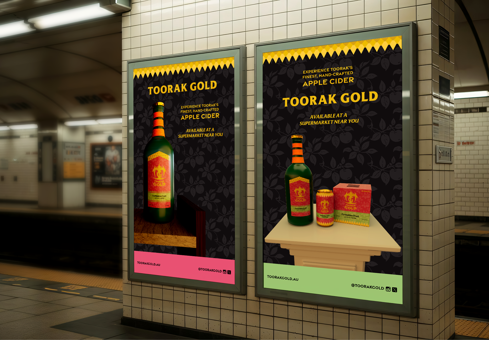
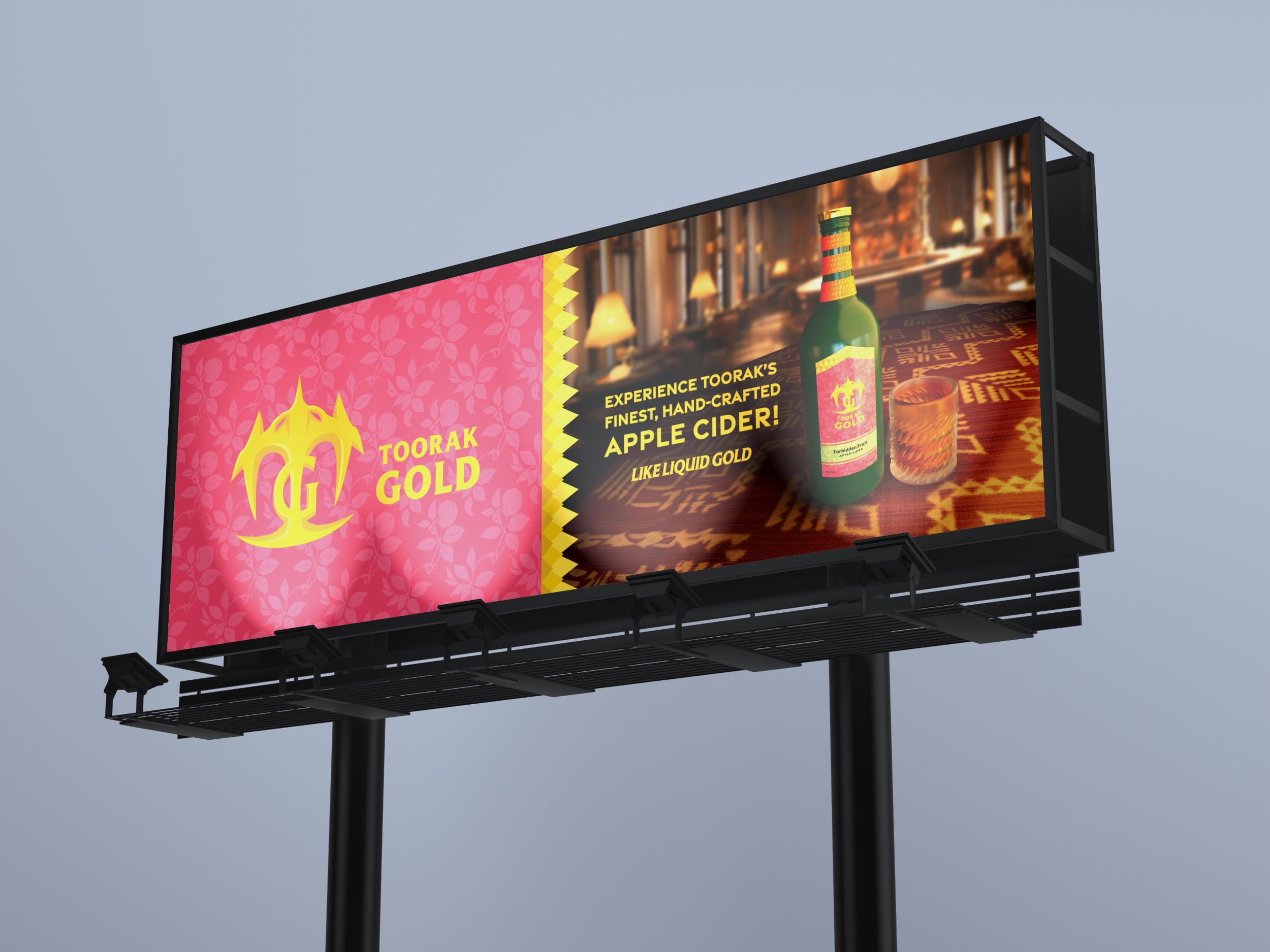
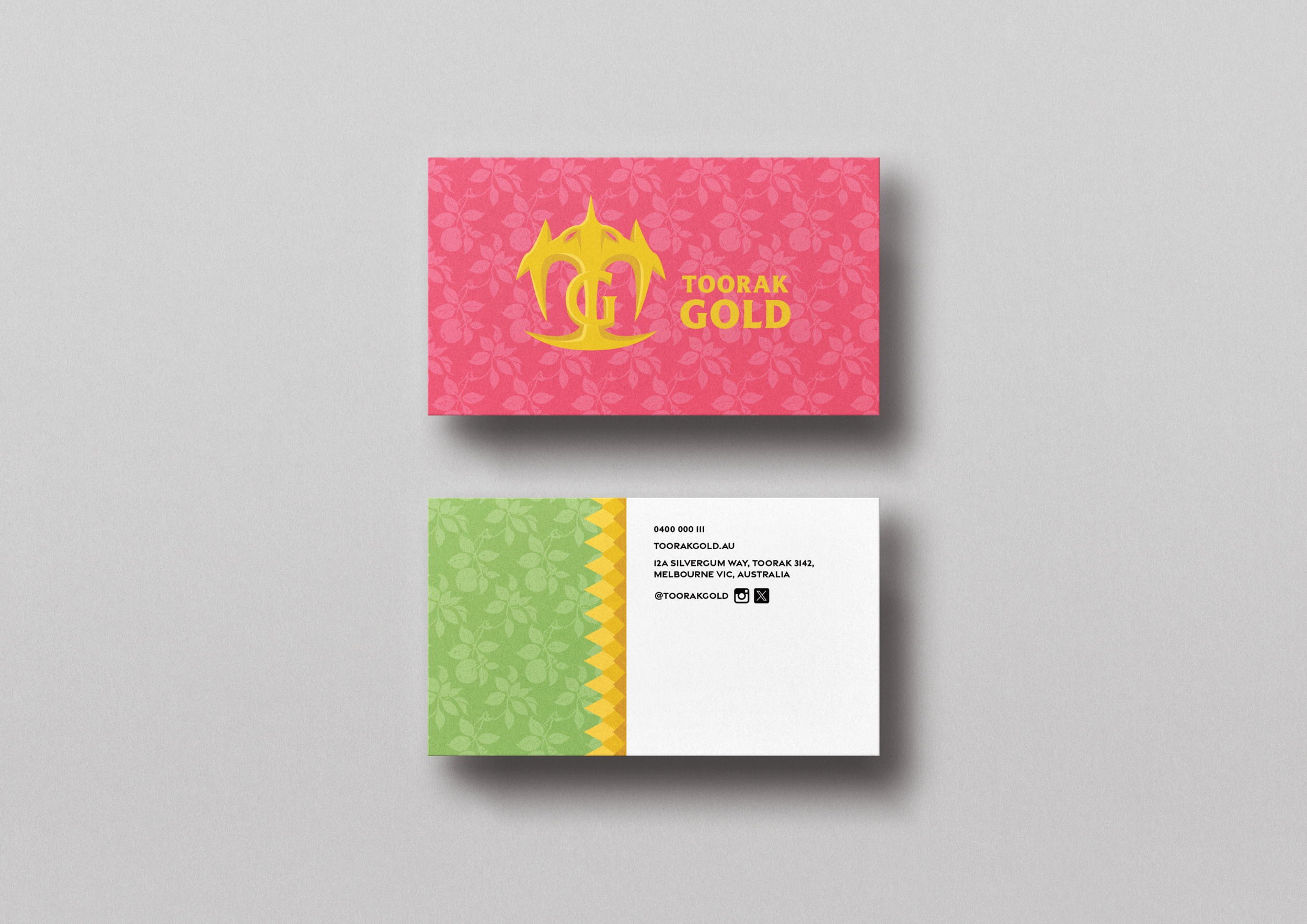
Toorak gold branding and packaging design
This work was my final capstone project for my university degree. The main focus was to brand a startup cider as something lavish and high-end, compared to the casual, pub-orientated image that cider traditionally has. This meant reflecting it’s identity through not just it’s imagery but it’s shape as well.
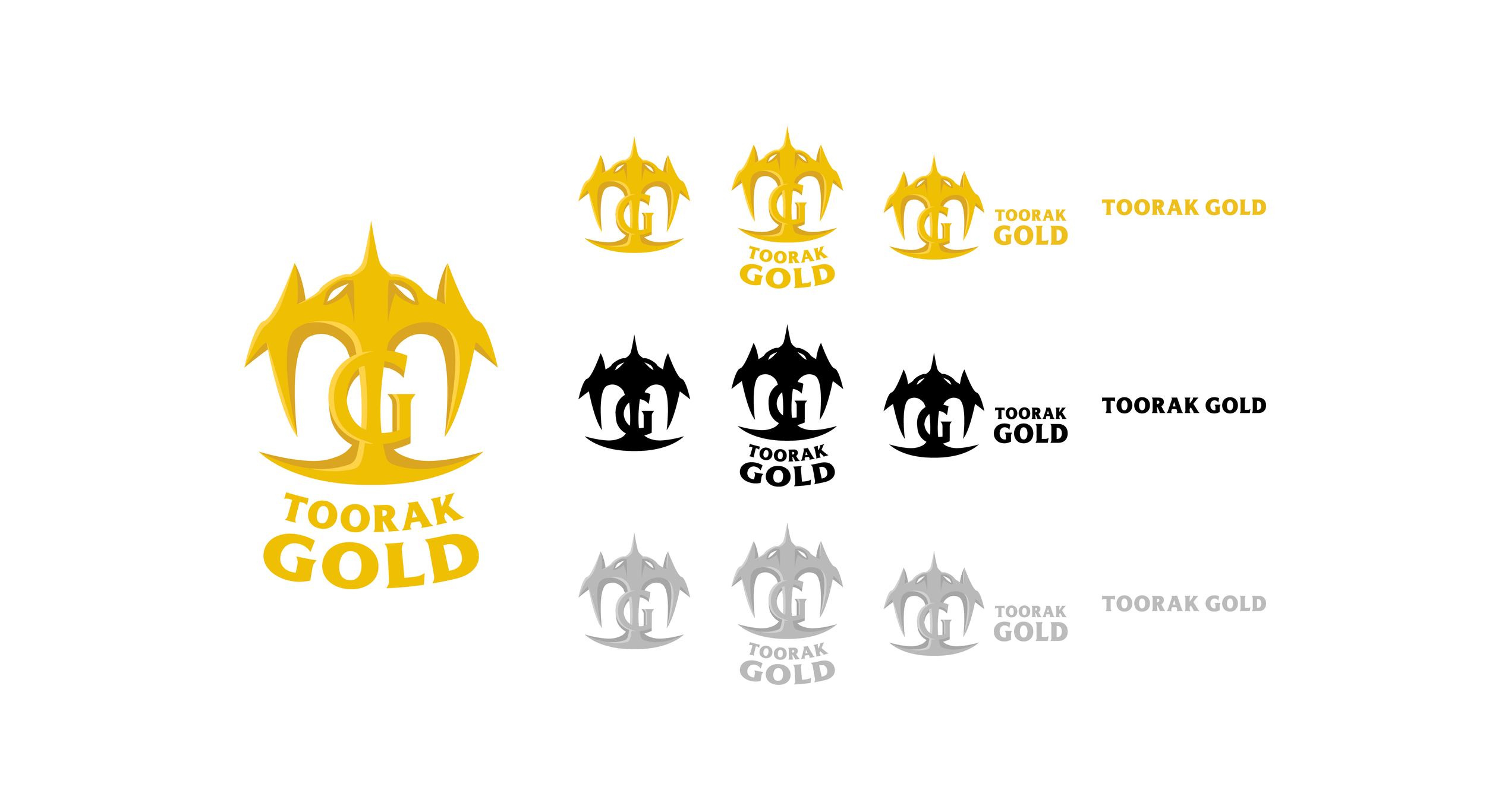
The brandmark presents itself as a golden, metallic form, appearing crown-like. There are also serpentine features with elements that evoke eyes or fangs, referring to the story of the Garden of Eden. As well as, it abstractly forming a barrel in it’s negative space. All these aspects come together to create a regal and exotic feel.
The name, Toorak Gold, utilizes the location of the cidery, as research dictates that it makes the beverage feel more authentic and trustworthy. The word, Gold, of course adds a sense of power and avarice.
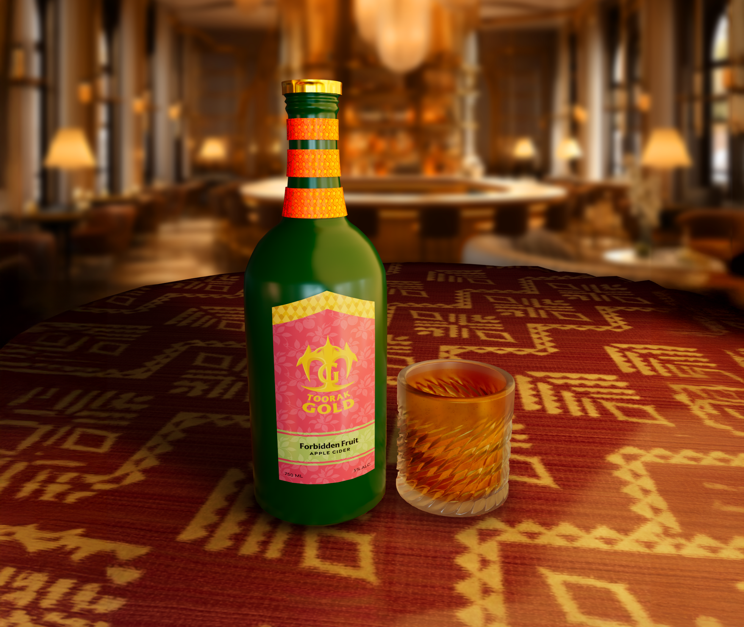
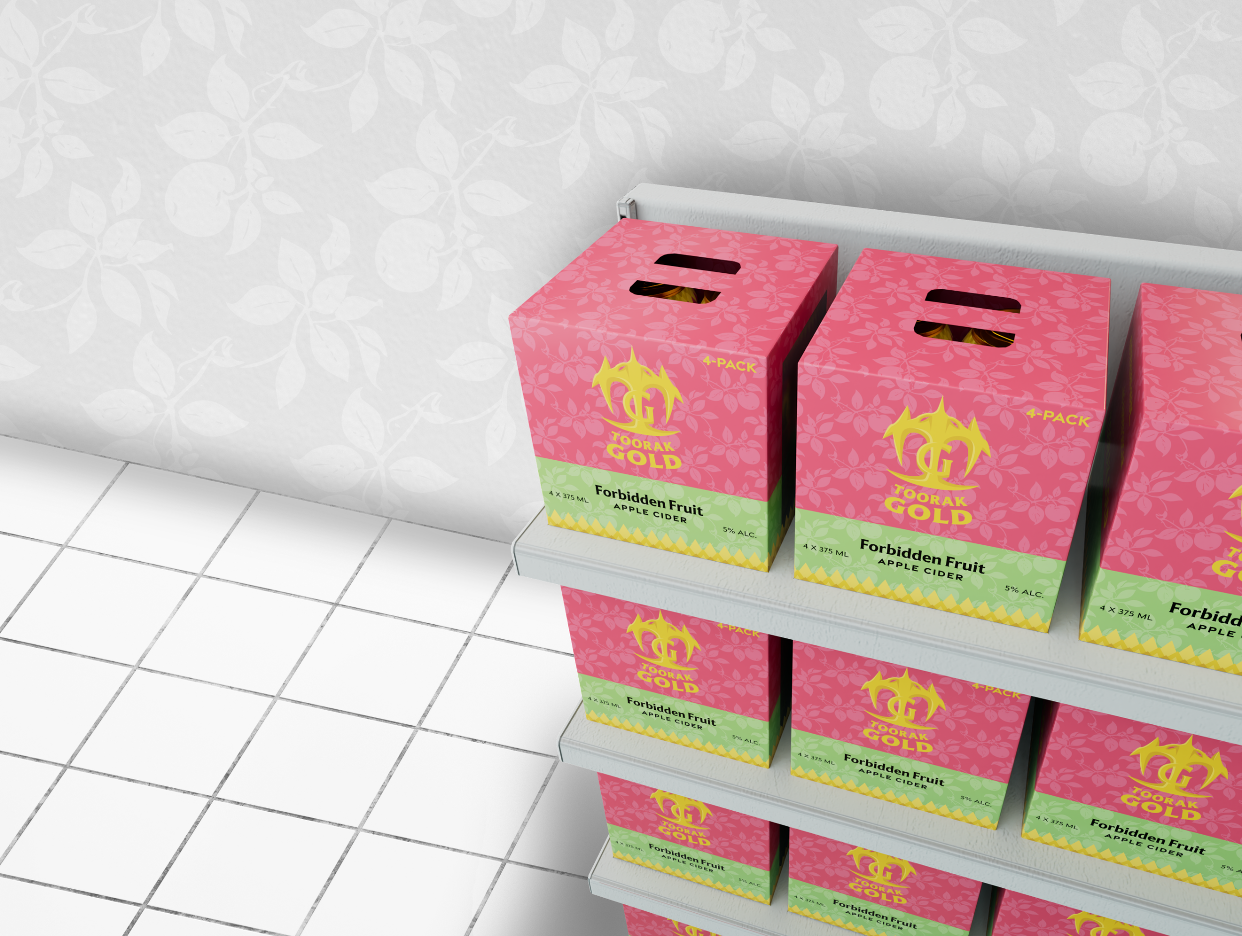
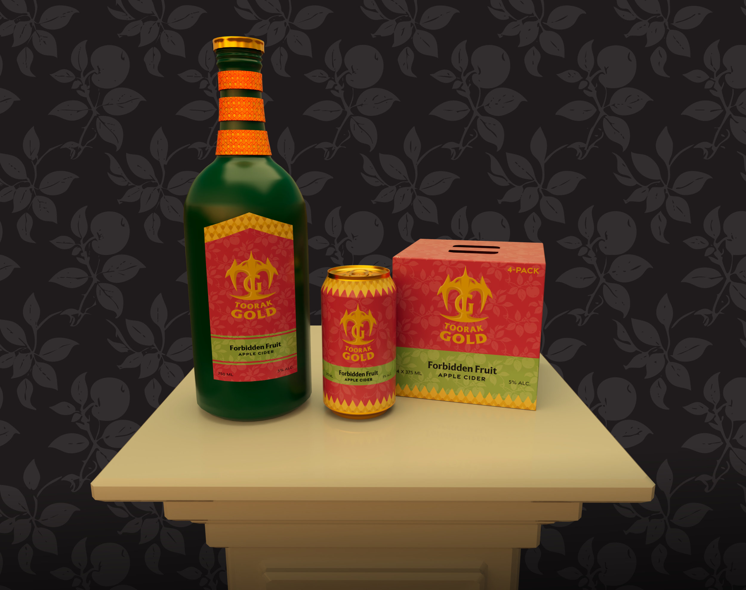
The graphic design has a primarily red and green colour scheme, overlayed with a floral pattern that makes it feel bright and alluring. A secondary branding pattern permeates throughout the design as well, resembling gold scales, leaning into the snake theming.
This continues towards the neck of the bottle which houses three golden rings, all engraved with the same pattern. This element subtlely looks like a snake coil and draws consumers towards the product.
The bottle itself is close to the shape of a wine bottle, as I felt it’s minimalistic yet sleek design fit it well.
The can follows suit with the style of the bottle, as even the aluminum is a shiny, golden colour. Supplementing this, it can be bought inside a four-pack box which has a cellophane window on the right side.